
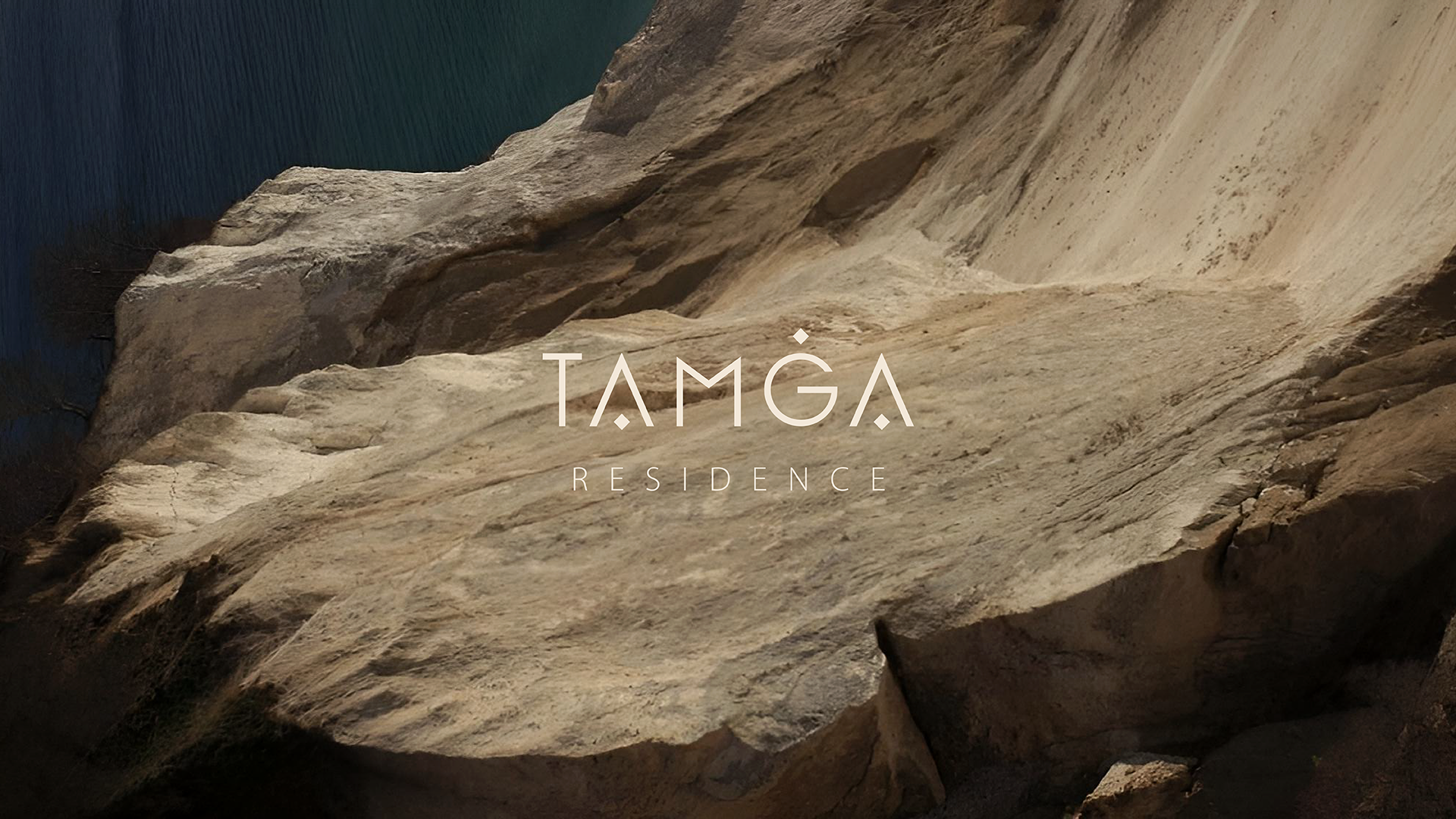
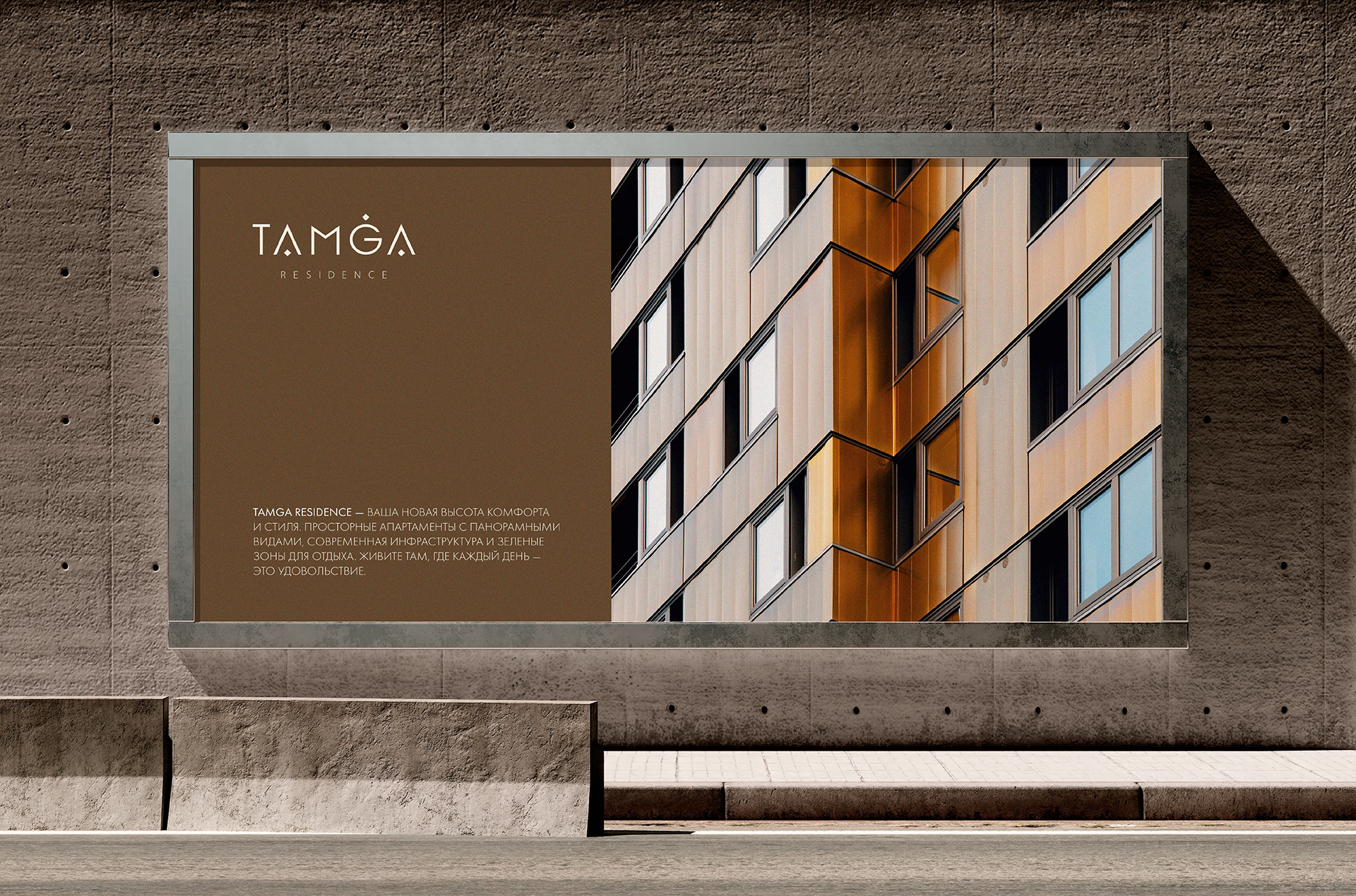
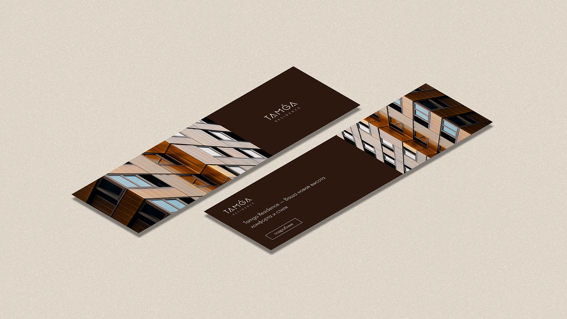
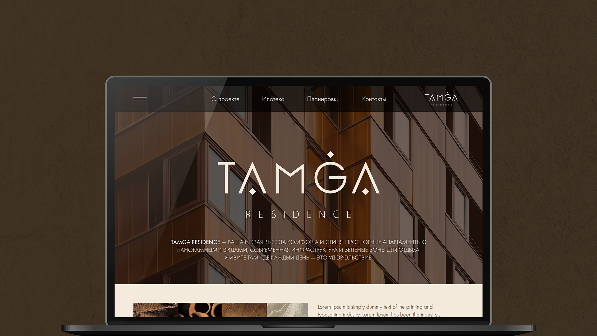
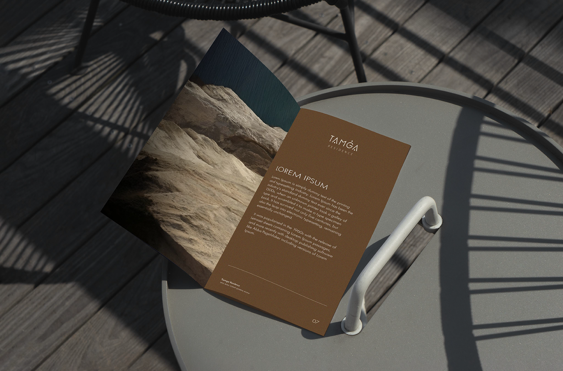
Tamga Residence by BI Group development company
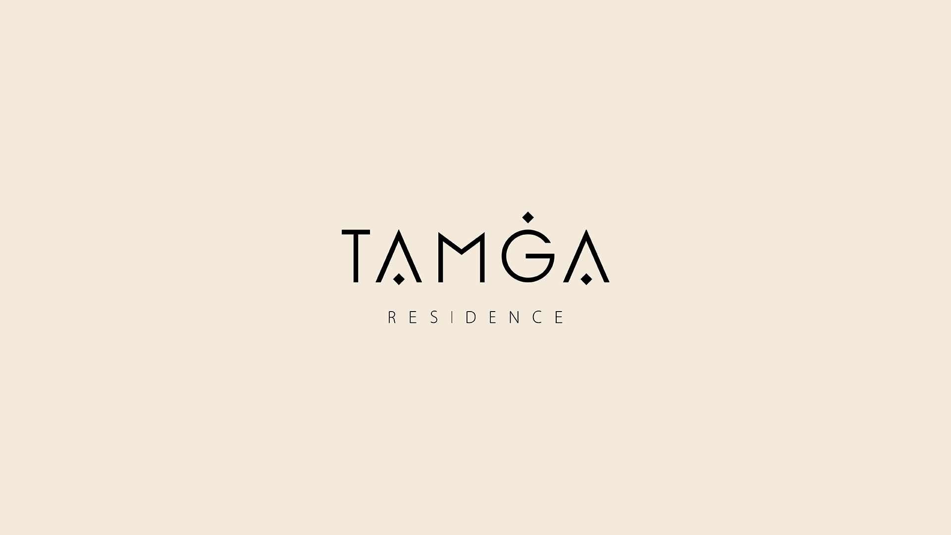
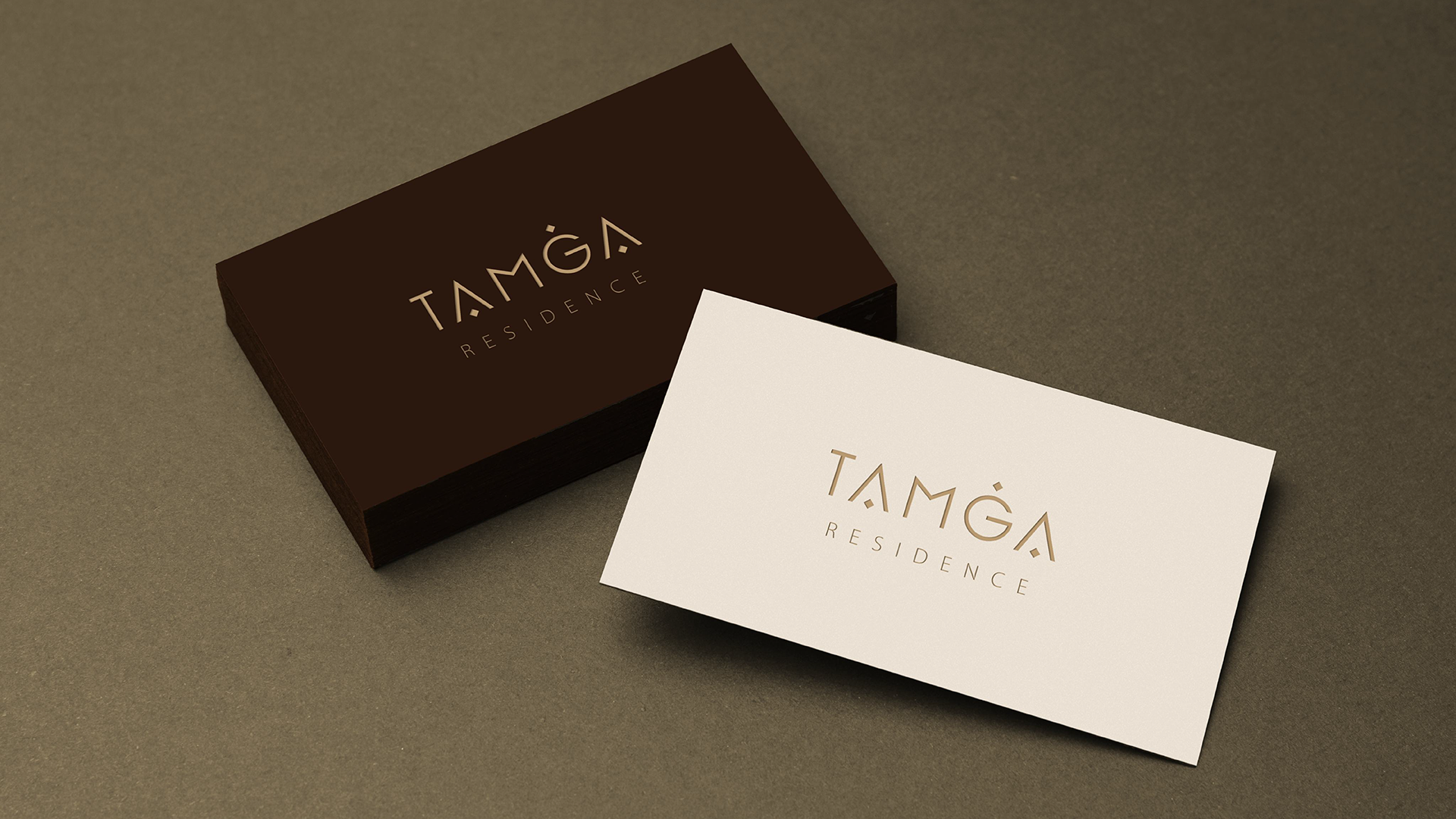
We developed the naming and visual identity for the new residential complex of the development company BI Group. The Tamga Residence concept is based on the symbol of the family tamga, a sign that has accompanied Kazakh clans for centuries. It is not just a logo, but a reminder of heritage and continuity. The logo is strict, balanced, and modern, incorporating graphic elements of family tamgas. Its proportions maintain an easy-to-read feel and a sense of reliability. The color palette in the Tamga Residence branding is inspired by nature itself: warm terracotta tones evoke the handcrafted work of artisans and the comfort of a home, while light, almost weightless shades create an atmosphere of the lightness and spaciousness of the Kazakh steppe.
Thanks for watching!
Show some love.